Putting control of their charging experience back into the users' hands @Brim
A comprehensive redesign of the Brim EV app, improving user flows, enhancing functionality, and giving drivers intuitive control over their charging experience, resulting in increased user satisfaction and streamlined operations @BrimChargers.
Duration
2 Years
My Role
Sole UX / UI Designer
Tools
Figma, Miro, Jira & Creative Cloud
Moving beyond the MVP
Brim’s mobile app was outdated, offering only basic functionality (start, stop, scheduling) and a clunky user experience. The design lacked brand consistency, appearing hastily built. To stay competitive, Brim needed a redesign to modernise the app, align it with their brand, improve workflow efficiency, and create a seamless user experience.


The Challenge
Outdated app with limited functionality (start, stop, scheduling).
Clunky, basic user experience.
Inconsistent with brand visuals, appearing hastily built.
The Solution
Modern app design for contemporary user experience.
Aligned app visuals with Brim's brand identity.
Improved workflow efficiency for smoother operations.
The Process
Mapping out the IA
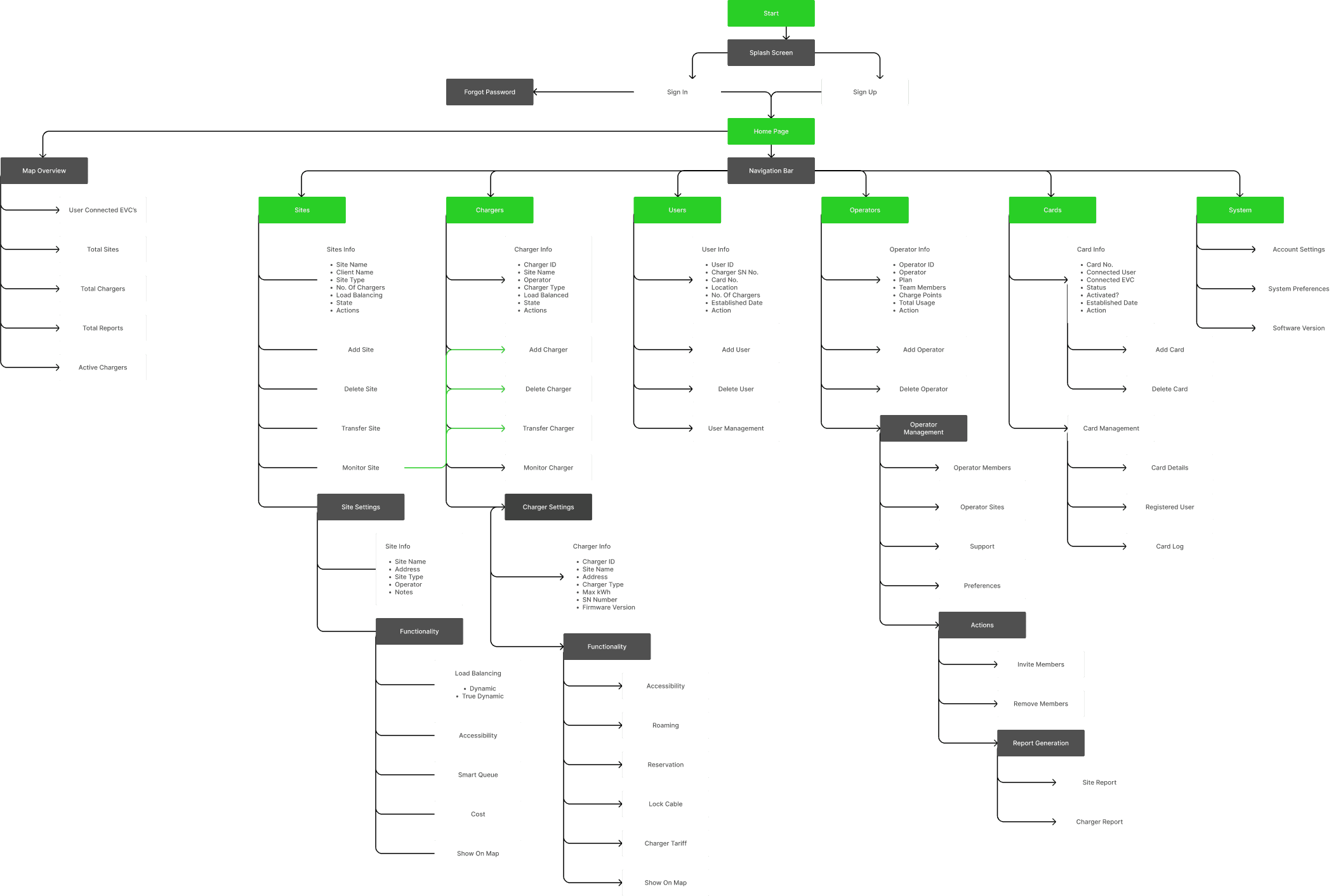
The first thing I did was map out the Information Architecture (IA) to identify opportunities for new features and establish clear parameters for the next iteration of the MVP.
Design system
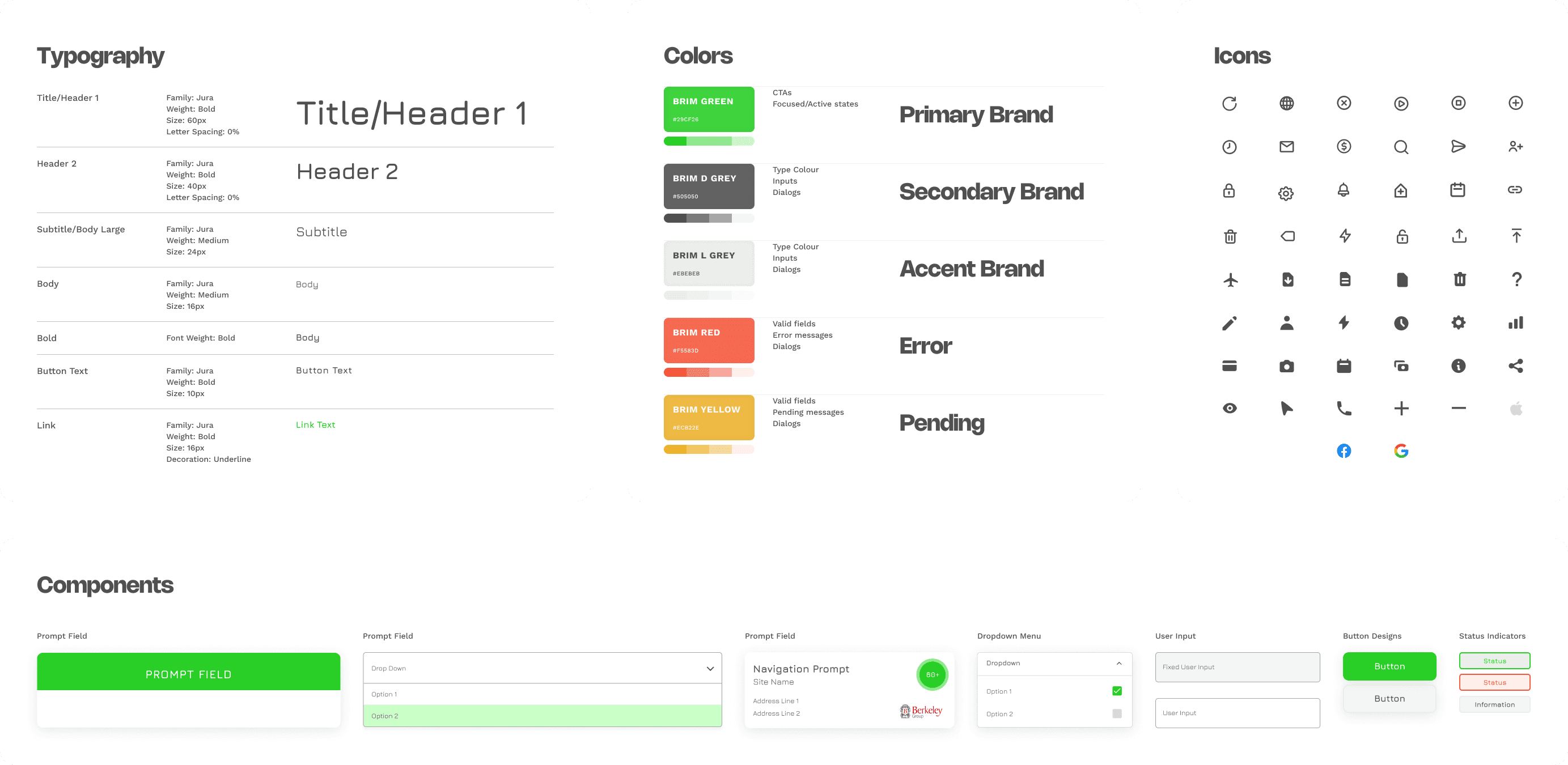
The next step was to transform Brim’s design guidelines into a scalable design system, ensuring consistency and efficiency while providing a solid foundation for the Brim EV app redesign.
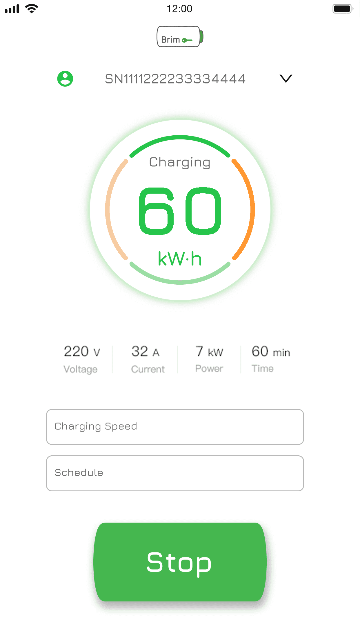
Initial Design Testing
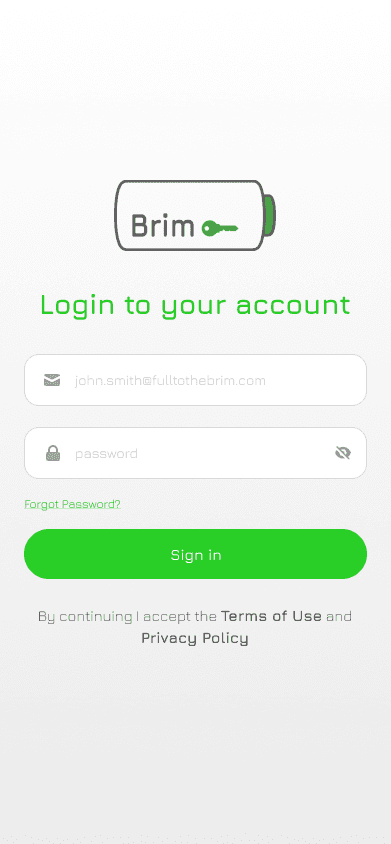


After 3-4 months of development, a working prototype was created to test functionality and interoperability between the app and charger, while also gathering valuable user feedback through live site testing. This phase was crucial for refining feature workflows and ensuring the design met user needs.
Post-production roundup
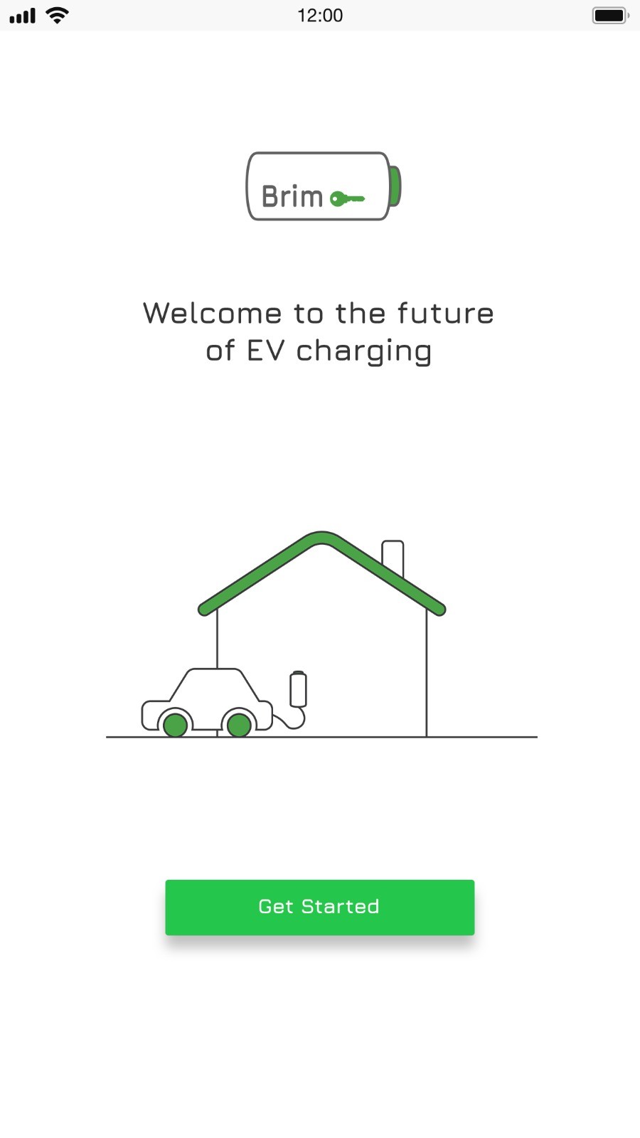
Barebones model for testing
The prototype focused on core functionality. Initial visuals were tested but required refinement to align with user expectations and brand identity.
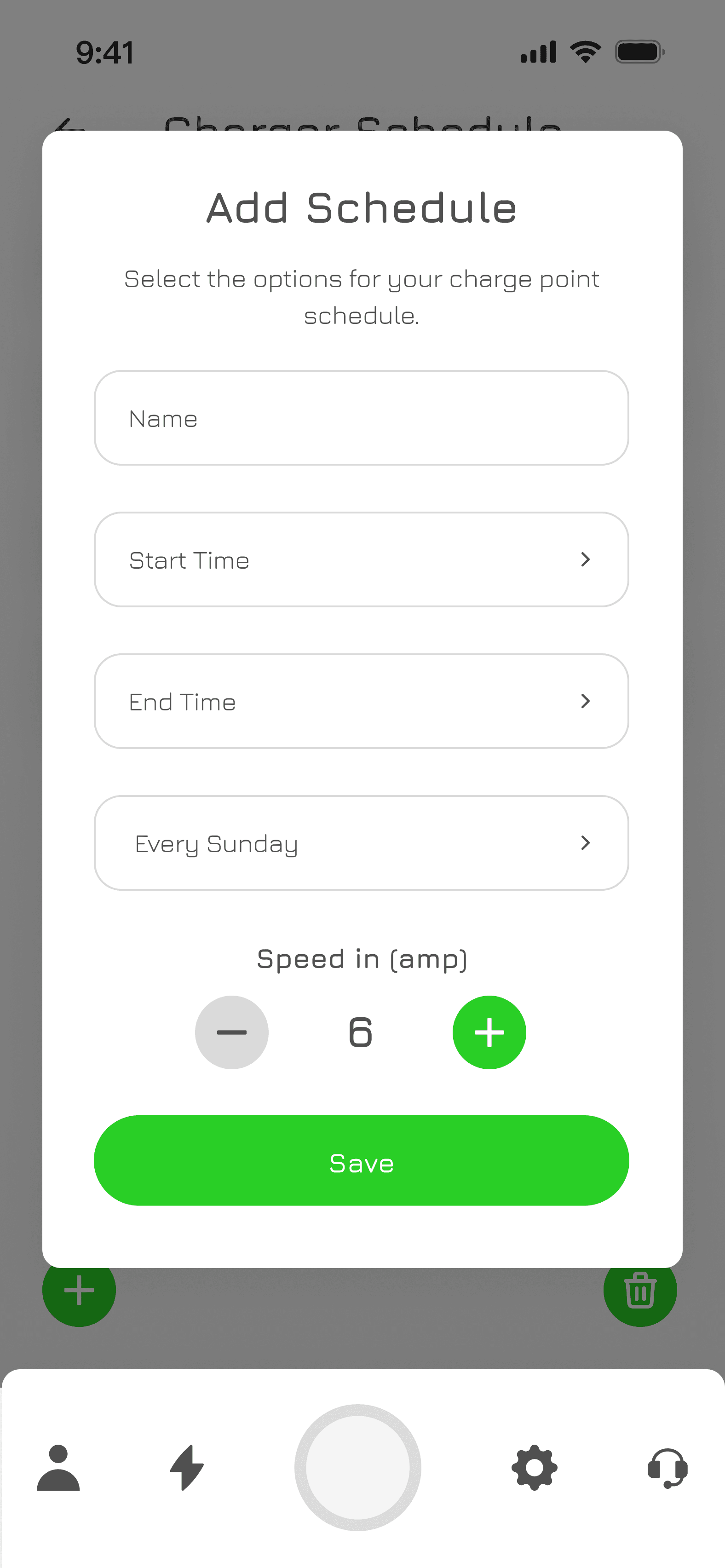
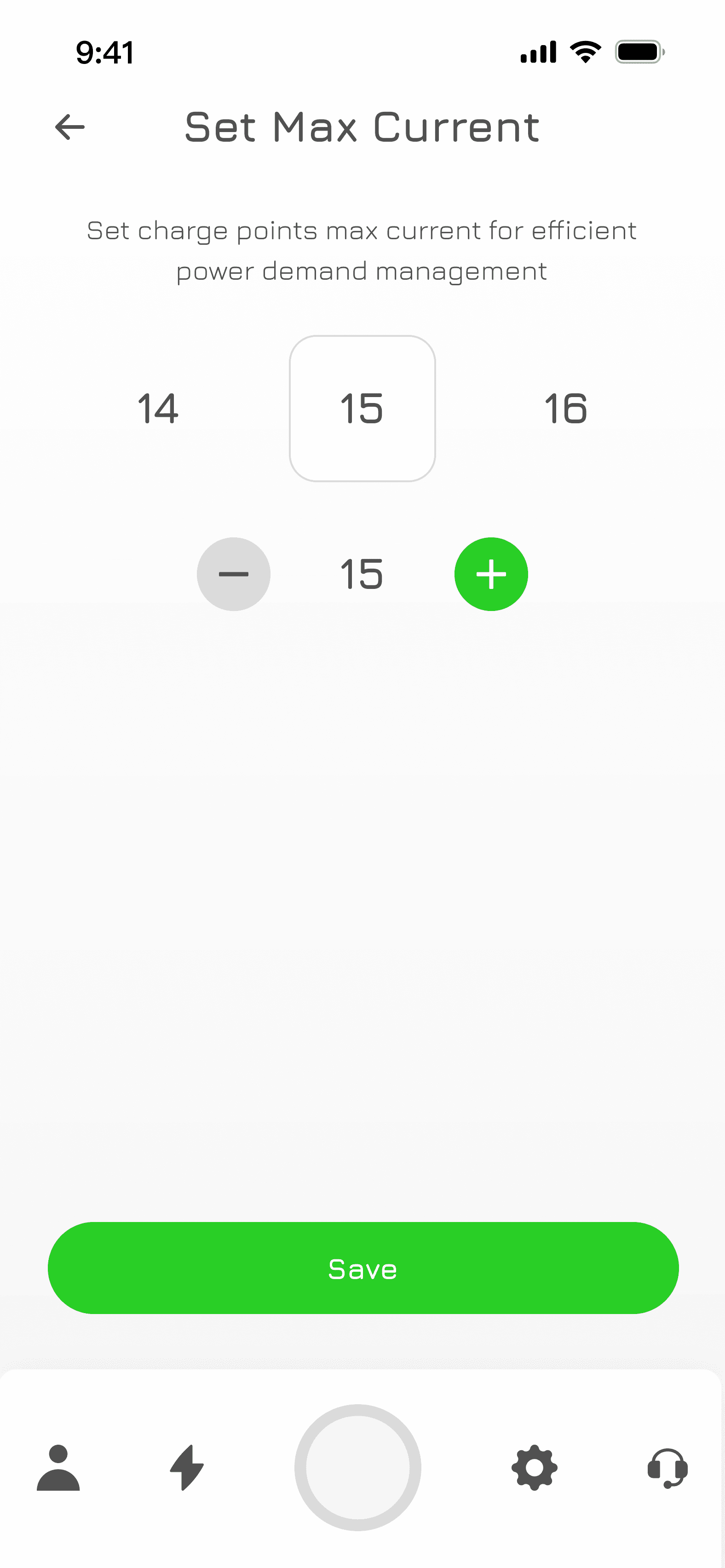
Streamline charger setup
Adding a charger was complex due to chargepoint protocols. Collaboration with the dev team was needed to simplify the process and improve usability.
Further design / testing needed
Further development and testing refined features, improved usability, and ensured the app met user needs and technical requirements.
The Solution
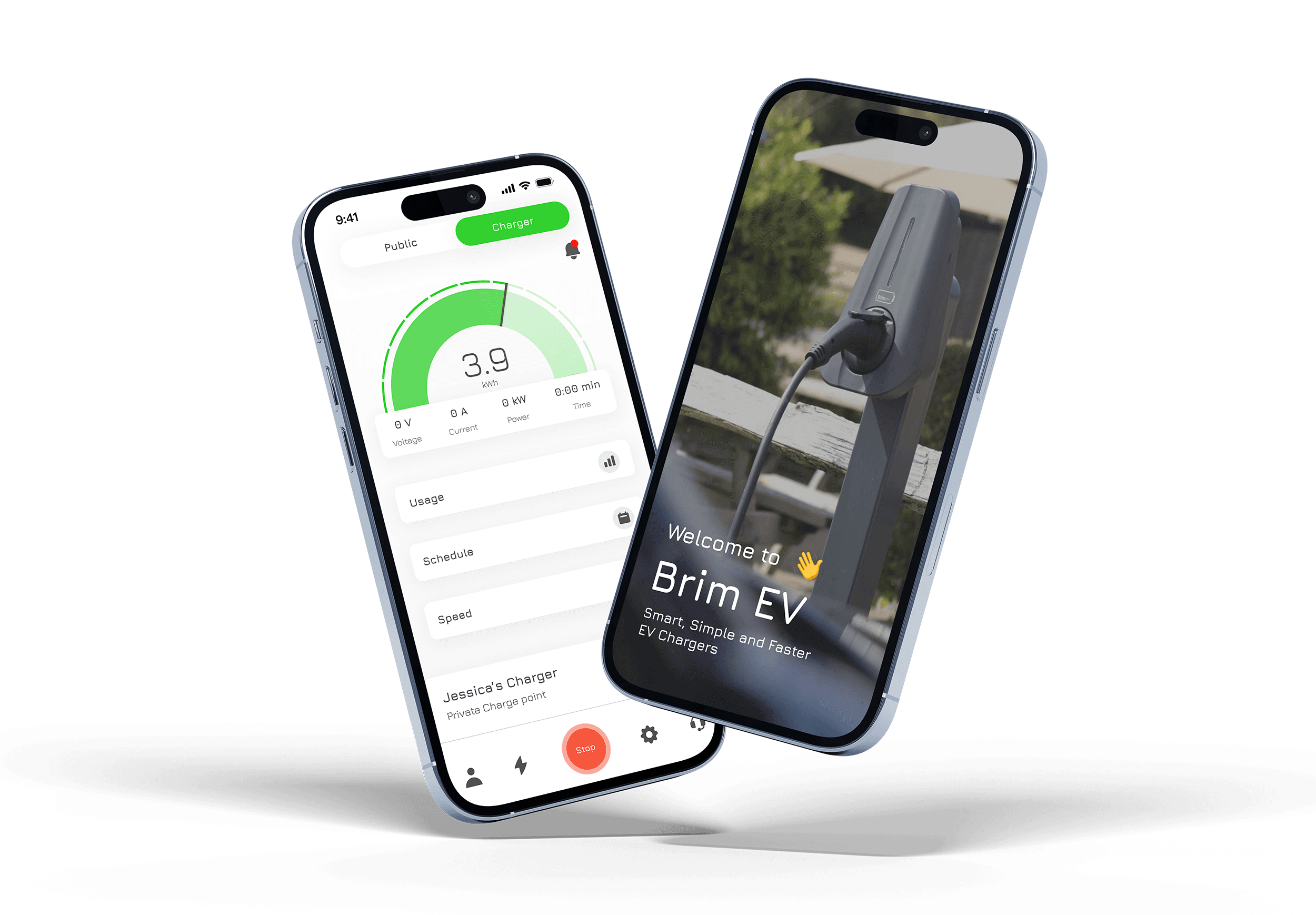
A detailed look
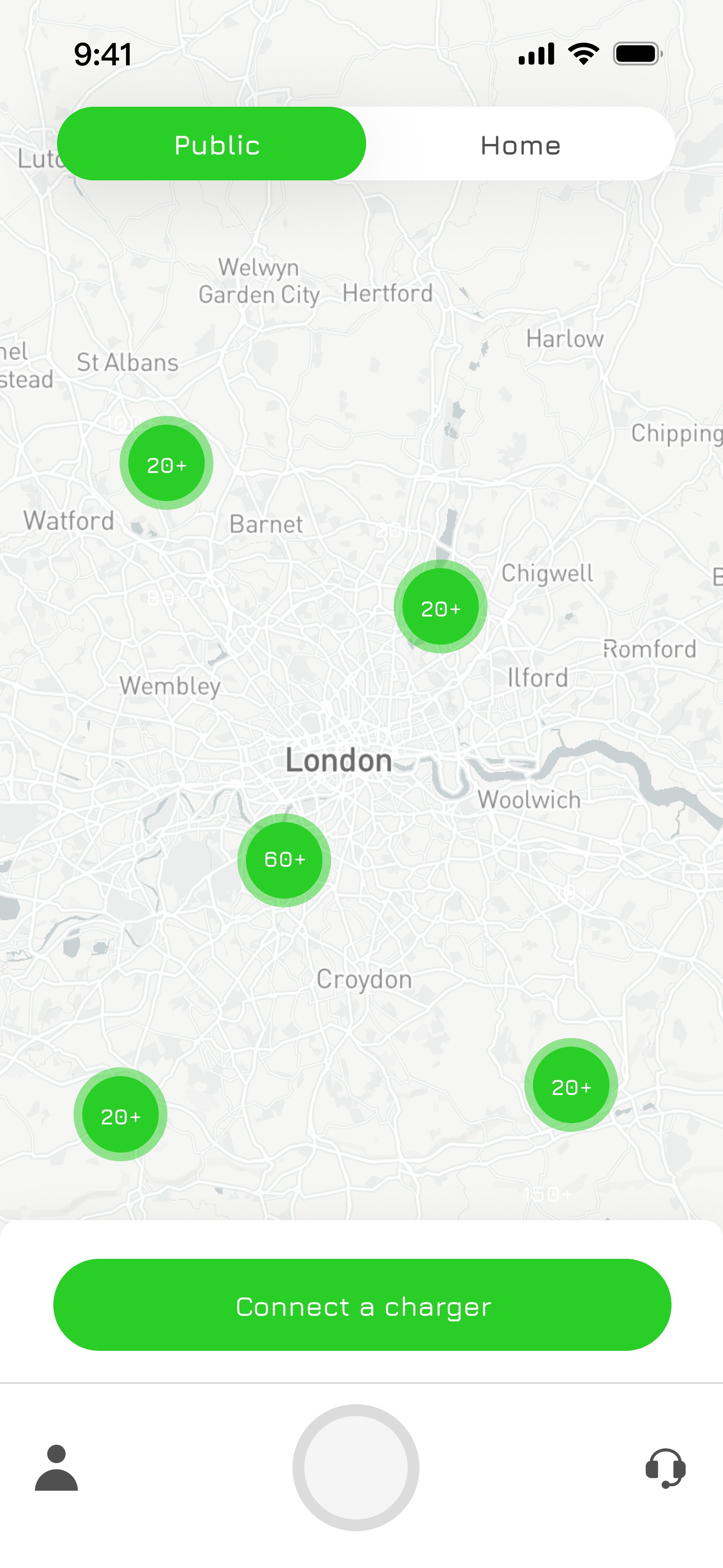
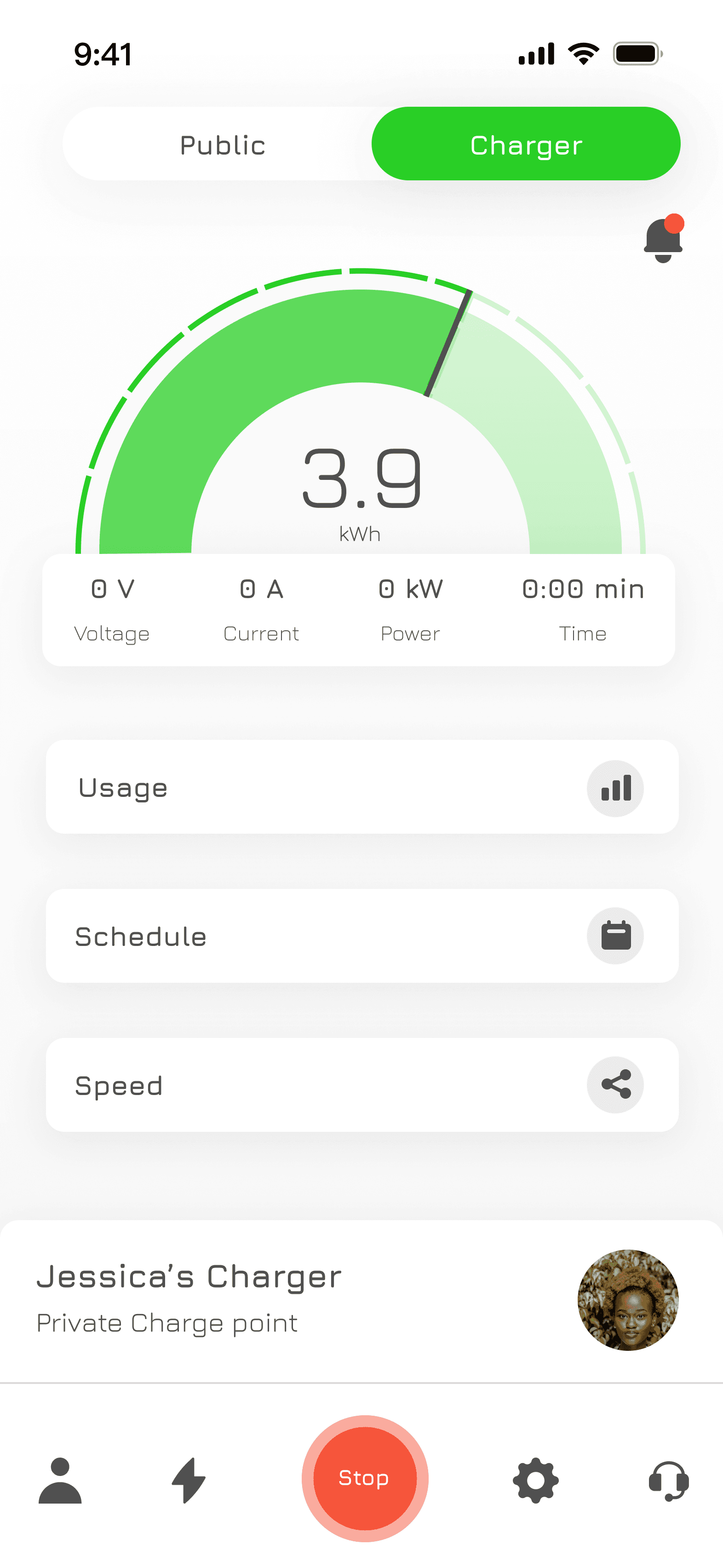
A simple toggle bar allows users to switch seamlessly between public and private charging modes
Public charger location map for easy route navigation
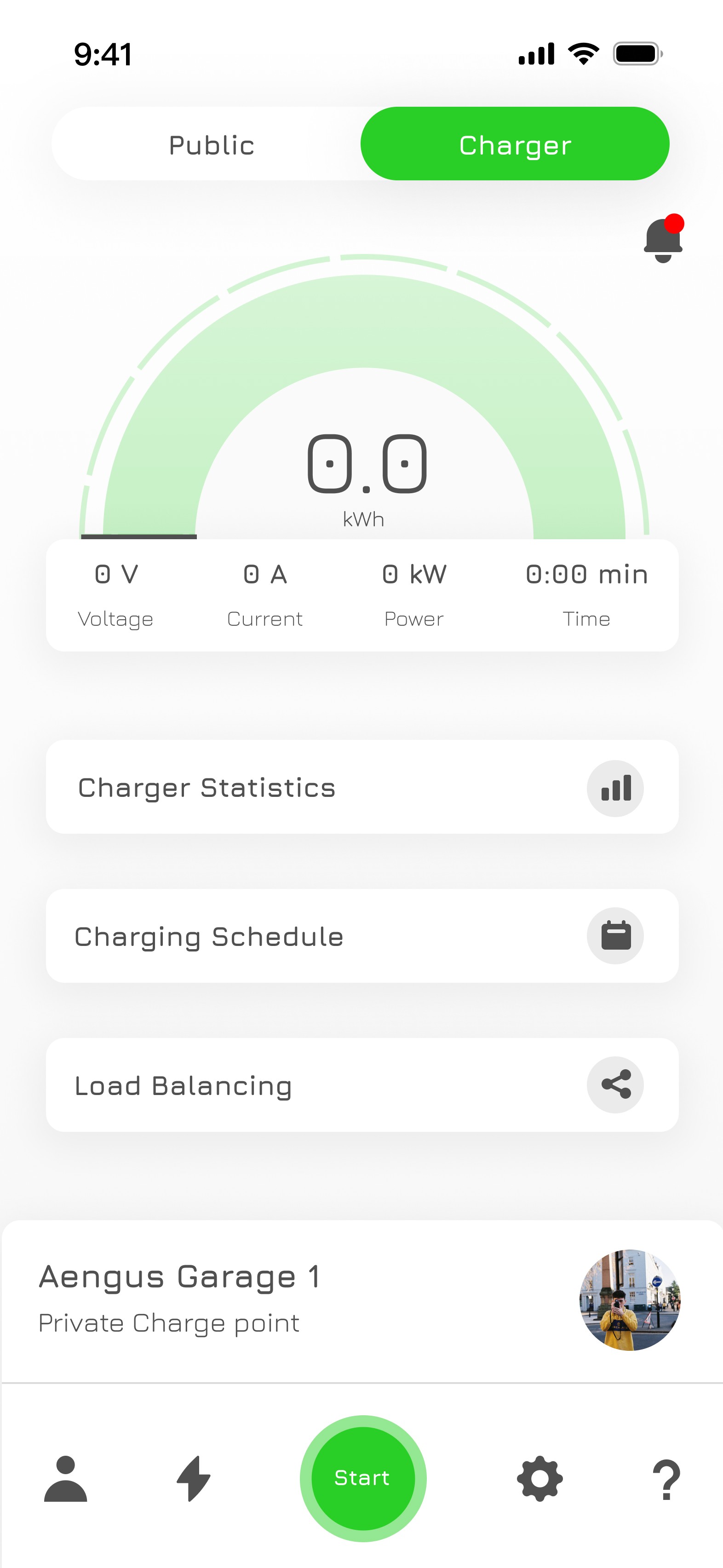
Speed dial for quick feedback on charging speeds
Users can analyse charging usage and speed across various time frames for trend analysis, providing detailed insights into their charging patterns
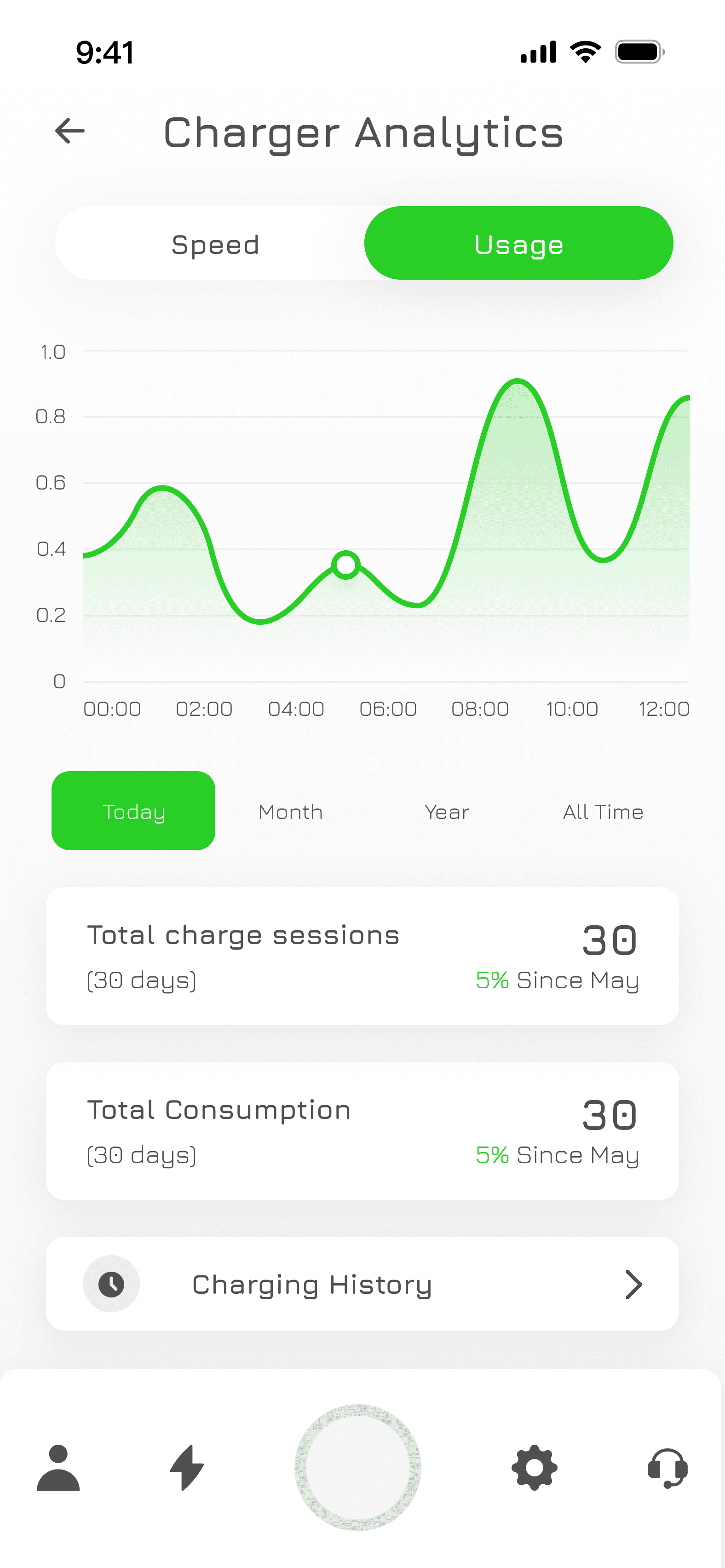
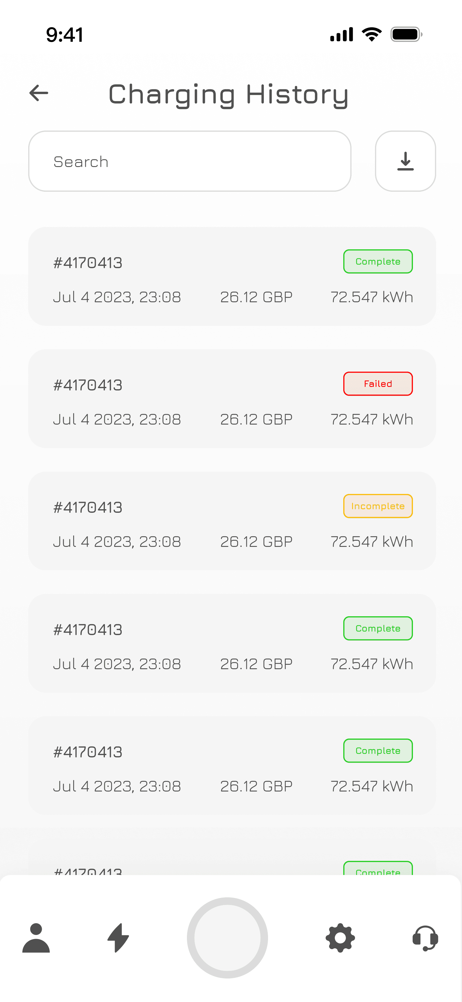
Every charging session is logged and tracked, with clear status indicators provided
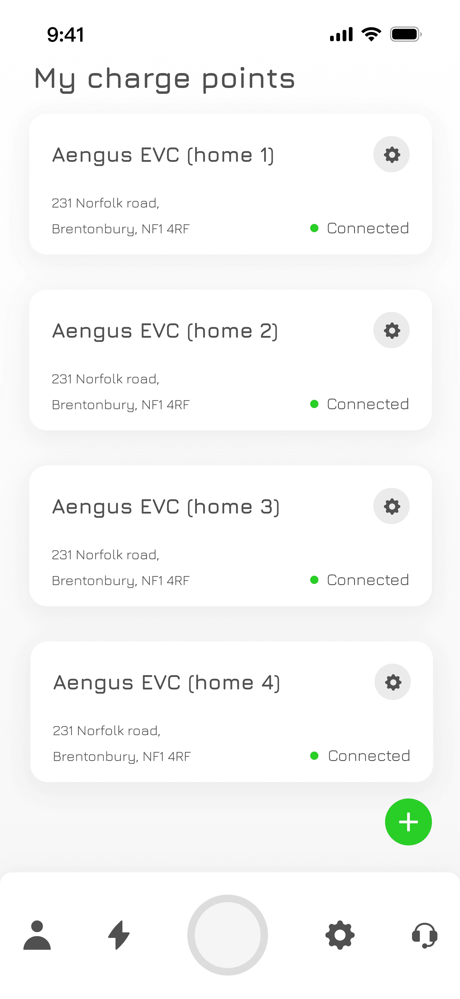
Additional Screens
Project Reflections
Brim EV has launched on both the Android and Apple appstores and is gradually being adopted as our client base grows with new charger installations. Success will take time to measure, and as the user base expands, we’ll address emerging UX issues to ensure continuous improvement.
Thanks for visiting, please come and say hello! 👋
Putting control of their charging experience back into the users' hands @Brim
A comprehensive redesign of the Brim EV app, improving user flows, enhancing functionality, and giving drivers intuitive control over their charging experience, resulting in increased user satisfaction and streamlined operations @BrimChargers.
Duration
2 Years
Tools
Figma, Miro, Jira & Creative Cloud
My Role
Sole UX / UI Designer
Moving beyond the MVP
Brim’s mobile app was outdated, offering only basic functionality (start, stop, scheduling) and a clunky user experience. The design lacked brand consistency, appearing hastily built. To stay competitive, Brim needed a redesign to modernise the app, align it with their brand, improve workflow efficiency, and create a seamless user experience.
The Challenge
Outdated app with limited functionality (start, stop, scheduling).
Clunky, basic user experience.
Inconsistent with brand visuals, appearing hastily built.
The Solution
Modern app design for contemporary user experience.
Aligned app visuals with Brim's brand identity.
Improved workflow efficiency for smoother operations.
The Process
Mapping out the IA
The first thing I did was map out the Information Architecture (IA) to identify opportunities for new features and establish clear parameters for the next iteration of the MVP.
Design system
The next step was to transform Brim’s design guidelines into a scalable design system, ensuring consistency and efficiency while providing a solid foundation for the Brim EV app redesign.
Initial Design Testing
After 3-4 months of development, a working prototype was created to test functionality and interoperability between the app and charger, while also gathering valuable user feedback through live site testing. This phase was crucial for refining feature workflows and ensuring the design met user needs.
The Solution
Initial Design Testing
Project Reflections
Brim EV has launched on both the Android and Apple appstores and is gradually being adopted as our client base grows with new charger installations. Success will take time to measure, and as the user base expands, we’ll address emerging UX issues to ensure continuous improvement.
Thanks for visiting, please come and say hello! 👋
Post-production roundup
Barebones model for testing
The prototype focused on core functionality. Initial visuals were tested but required refinement to align with user expectations and brand identity.
Streamline charger setup
Adding a charger was complex due to chargepoint protocols. Collaboration with the dev team was needed to simplify the process and improve usability.
Further design needed
Further development and testing refined features, improved usability, and ensured the app met user needs and technical requirements.