Enhancing product discovery and brand perception @Healthy Foods
A comprehensive redesign of the Brim EV app, improving user flows, enhancing functionality, and giving drivers intuitive control over their charging experience, resulting in increased user satisfaction and streamlined operations @BrimChargers.
Duration
1 Week
My Role
Personal Project
Tools
Figma & Creative Cloud
Design Brief
Healthy Foods has asked for a redesign of their app, along with recommendations on how to modernise their brand to create a more exciting and engaging appeal.
Enhance Discovery
Simplify navigation to help users find products that align with their health goals.
Streamline Checkout
Create an intuitive process to encourage quicker purchases and increase completion rate.
Modernise Brand
Develop a contemporary design to reinforce Healthy Foods as a trusted brand.
The Problem
A high rate of abandoned baskets.
Many users are browsing without adding items to their basket.
The brand is perceived as outdated in the market.
The Challenge
To suggest changes to the User flow to reduce the abandonment rates
To redesign 2-3 screens to increase the speed of checkout;
To redesign the UI with a modern, engaging position.
Key Insight
Healthy Foods must address a diverse wellness trend due to the lack of a single target demographic, as 57.6% of US adults aged 20 and over use dietary supplements, highlighting the need for effective discovery and tailored options.
Identifying areas for improvement
Below are key insights and recommendations to enhance the user experience and interface of the existing designs, addressing usability issues and boosting engagement and conversion potential.
Problems Identified
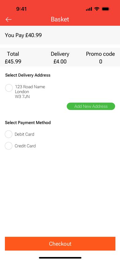
No guest checkout or progress tracker.
Calculation errors and missing user info.
No automated address entry or visual cues.
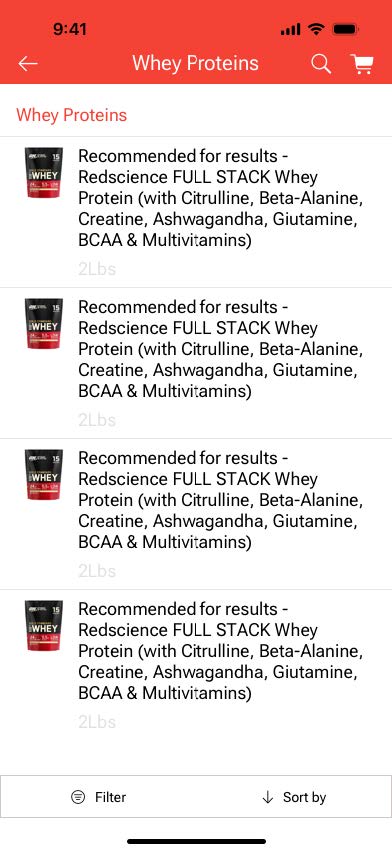
Unclear product titles, missing prices, and inconsistent units.
Suggested Improvements
Enable guest checkout and add a progress tracker.
Ensure accurate prices and streamline user input.
Fix key buttons at the bottom for accessibility.
Show reviews, ratings, and social proof for trust.
Add clear product info, photos, and filters.
The results
Drawing on these competitors, Healthy Foods can enhance its app by creating a visually clean, easily navigable experience with quick checkout options, establishing itself as a modern, reliable player in the supplement space.
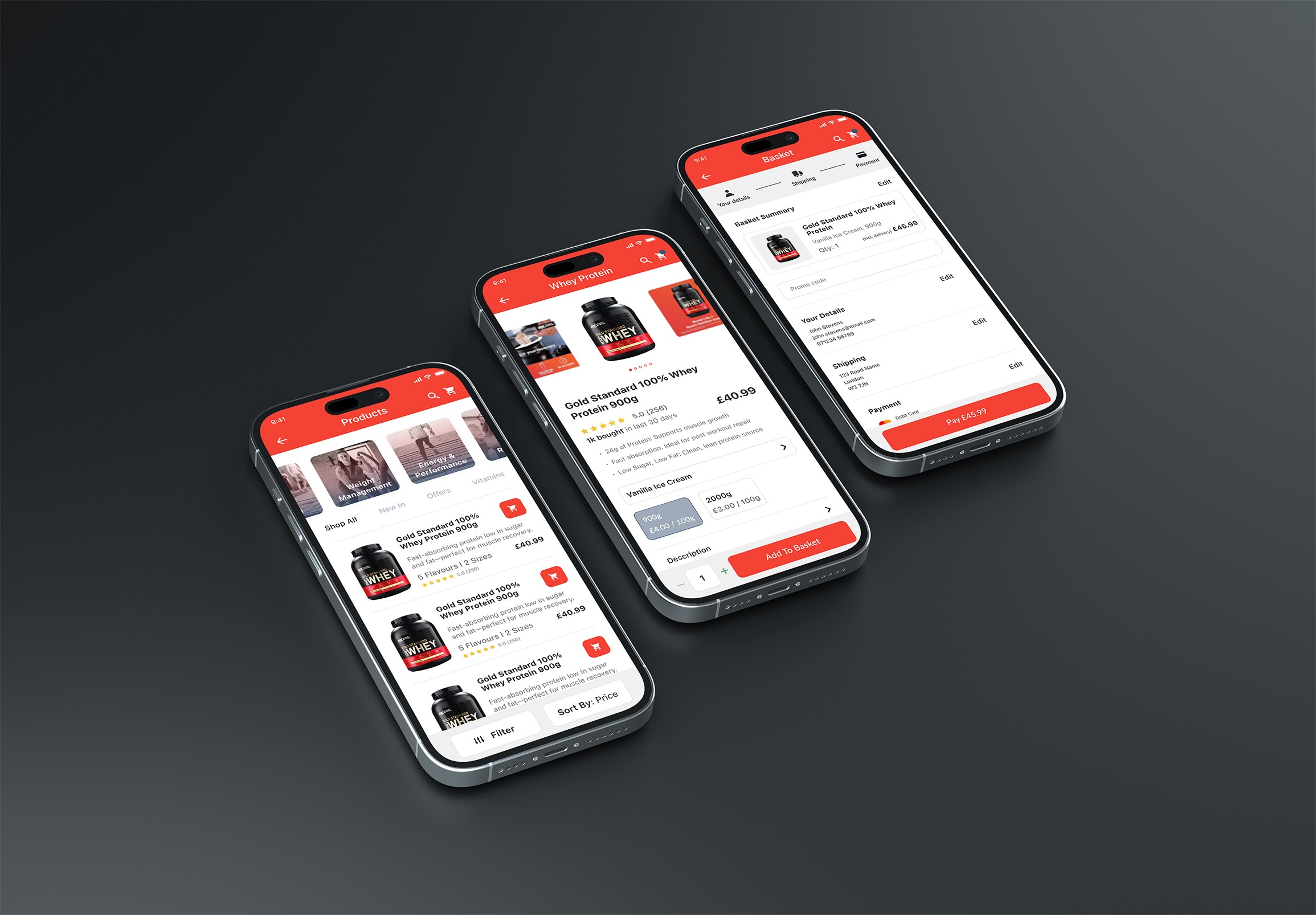
“Shop All,” “New In,” “Offers,” and “Vitamins” Sections
Featuring trending and special items encourages exploration, increasing product additions by making deals and new arrivals easy to find, while reinforcing a dynamic brand image.
Clear and Well Informed Product Tiles
Each product tile now displays price, highlights, UK metrics, quick add-to-basket, and social proof, encouraging quick decisions, increasing adds, and reducing abandonment for a more trusted, user-focused experience.

Goal Based Product Categories
Providing clear access to popular categories like “Weight Management” and “Energy & Performance” streamlines browsing, reducing basket abandonment and enhancing perception as modern and expertly curated.
Sticky Filter & Sort Buttons
Keeping filters accessible allows users to refine searches without losing their place, boosting engagement and creating a seamless, user-friendly experience that enhances brand perception.
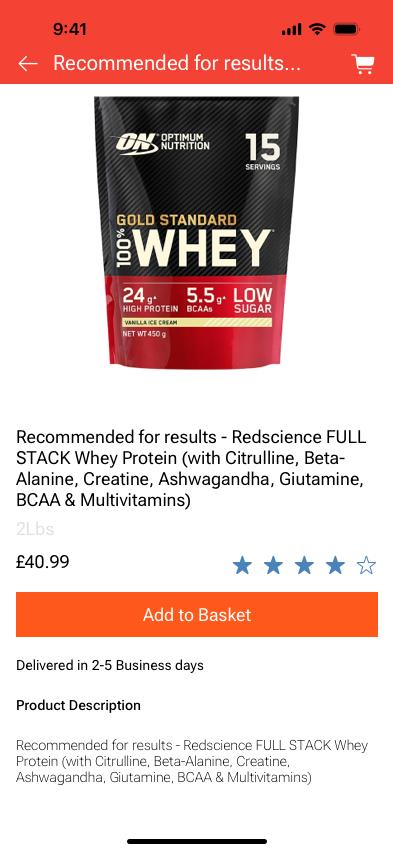
Comprehensive Product Display
Additional product photos, a bold title, and visible social proof (e.g., recent purchases) give users a clear view of a product’s quality and popularity, building trust and speeding up decisions to boost adds to basket.
Customisable Options (Flavours, Sizes, & Quantity)
Clear flavour and sizing options, along with a quantity selector, offer users flexibility, reducing abandonment by enabling easy personalisation and supporting a user-friendly experience.

Sticky “Add to Basket” with Clear Pricing
The “Add to Basket” button and quantity selector are always visible, encouraging seamless additions by reducing friction, promoting faster actions, and boosting conversions.
Expanded Product Information
Key benefits, ingredients, nutritional information, and additional details are accessible in organised dropdown tabs for users seeking more information, supporting informed purchases and engaging detail-oriented users while keeping the interface clean and navigable.
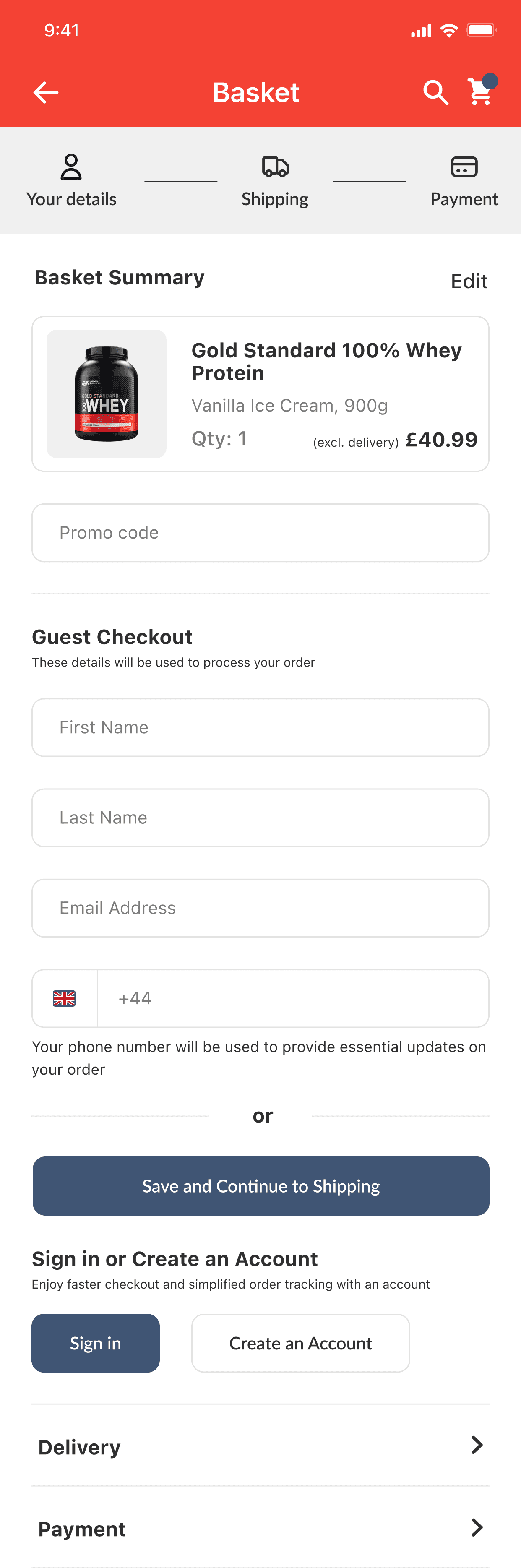
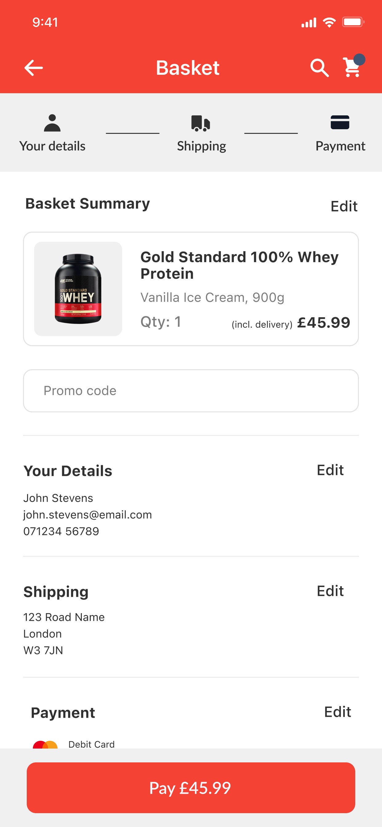
Progress Visibility
A checkout progress tracker clearly shows the user’s position in the process, alleviating uncertainty and boosting completion rates by indicating how far they’ve come.
Basket Summary
A concise overview displaying product images, titles, flavours, sizes, quantities, and pricing (including and excluding shipping) enhances UX by providing clarity and reassurance, helping users confirm their selections and reducing errors during checkout.
Guiding the User
The top-down checkout presents fields sequentially, revealing the "Pay" button only after necessary information is entered, simplifying input and encouraging completion, thus reducing abandonment rates.
Key Learnings
To us, it's a redesign; to the user, it's about making healthier choices easier and more accessible.
In a competitive market, aligning design with user needs can build trust and drive conversions.
What might seem like a small update—modernising the design—actually plays a huge role in improving the overall user experience and brand perception.
Thanks for visiting, please come and say hello! 👋
Enhancing product discovery and brand perception @Healthy Foods
A comprehensive redesign of the Brim EV app, improving user flows, enhancing functionality, and giving drivers intuitive control over their charging experience, resulting in increased user satisfaction and streamlined operations @BrimChargers.
Duration
1 Week
My Role
Sole UX / UI Designer
Tools
Figma & Creative Cloud
Design Brief
Healthy Foods has asked for a redesign of their app, along with recommendations on how to modernise their brand to create a more exciting and engaging appeal.
Enhance Discovery
Simplify navigation to help users find products that align with their health goals.
Streamline Checkout
Create an intuitive process to encourage quicker purchases and increase completion rate.
Modernise Brand
Develop a contemporary design to reinforce Healthy Foods as a trusted brand.
The Problem
A high rate of abandoned baskets.
Many users are browsing without adding items to their basket.
The brand is perceived as outdated in the market.
The Challenge
To suggest changes to the User flow to reduce the abandonment rates
To redesign 2-3 screens to increase the speed of checkout;
To redesign the UI with a modern, engaging position.
Key Insight
Healthy Foods must address a diverse wellness trend due to the lack of a single target demographic, as 57.6% of US adults aged 20 and over use dietary supplements, highlighting the need for effective discovery and tailored options.
Identifying areas for improvement
Below are key insights and recommendations to enhance the user experience and interface of the existing designs, addressing usability issues and boosting engagement and conversion potential.
Problems Identified
No guest checkout or progress tracker.
Calculation errors and missing user info.
No automated address entry or visual cues.
Unclear product titles, missing prices, and inconsistent units.
Suggested Improvements
Enable guest checkout and add a progress tracker.
Ensure accurate prices and streamline user input.
Fix key buttons at the bottom for accessibility.
Show reviews, ratings, and social proof for trust.
Add clear product info, photos, and filters.
The results
Drawing on these competitors, Healthy Foods can enhance its app by creating a visually clean, easily navigable experience with quick checkout options, establishing itself as a modern, reliable player in the supplement space.
Redesigned E-Commerce Platform for Enhanced Navigation, Clear Product Information, and Seamless User Experience
Sections like “Shop All,” “New In,” “Offers,” and “Vitamins” highlight trending items, encouraging exploration. Product tiles display price, highlights, quick add-to-basket, and social proof for faster decisions. Goal-based categories like “Weight Management” simplify browsing, while sticky filters ensure seamless refinement, enhancing the user experience.
Enhanced Product Display and Customisation Features for Informed, Frictionless Purchases
The redesign includes comprehensive product displays with additional photos, bold titles, and visible social proof to build trust and speed up decisions. Customisable options like flavours, sizes, and quantity selectors offer flexibility, reducing abandonment. A sticky “Add to Basket” button with clear pricing ensures seamless additions, while expanded product information in dropdown tabs provides key details for informed purchases, keeping the interface clean and user-friendly.
Streamlined Checkout Process with Progress Visibility and Guided User Flow
A checkout progress tracker keeps users informed of their position, reducing uncertainty and boosting completion rates. A concise basket summary displays product details, pricing, and shipping information, ensuring clarity and reducing errors. The top-down checkout reveals fields sequentially and only shows the “Pay” button after necessary information is entered, simplifying input and encouraging completion to reduce abandonment.
Key Learnings
To us, it's a redesign; to the user, it's about making healthier choices easier and more accessible.
In a competitive market, aligning design with user needs can build trust and drive conversions.
What might seem like a small update—modernising the design—actually plays a huge role in improving the overall user experience and brand perception.
Thanks for visiting, please come and say hello! 👋